Posted on
Design UI for your user’s mental model, not your ego
Introduction
There have been many occasions in the past few years I have said to my partner as I watch her fumble her way around a website she is unfamiliar with -
‘I could learn a lot watching you browse a website’.
I’ve never meant it in a derogatory way. She is what I would consider an average user. Not entirely familiar with technologies or UI design trends, but wants things to work correctly. With as little frustration as possible.
It’s not too much to ask, is it?
However, many of us in web development and UI design have forgotten this. Instead, we design UI's based on trends and preferences. And while this may turn out award-winning designs (not for me…), usability often goes out of the window.
It’s something I am guilty of.
However, recently I read a number of articles on mental models. Particularly in the field of UI design. Those articles helped me understand the reasons why I feel that I can learn from my partner’s usage.
In its simplest form, a mental model is an idea we hold on how something we experience should work. If your UI design looks similar to something they are already familiar with, they will expect your product to work in the same way.
Take an ATM/cash machine as an example. We all expect the process to begin with putting our card in, being presented with a number of choices on the screen, and finally withdrawing our money and/or retrieving our card.
Because of this expectation, many ATMs follow a similar UI design pattern. From my own mental model, I can describe it as:
Display on the left-hand side
Option keys on either side of the display
Keypad with 0-9*# layout below the screen
Card receptacle on the right-hand side
Cash dispenser below the card receptacle
From a model I hold in my mind, I am able to describe the vast majority of ATMs. Having ATMs follow this UI design pattern helps us complete the task with little to no assistance from others.
If the system we are using differs from a mental model we have or follows no particular UI design pattern, the task will take longer to complete and will require more effort.
In the worst-case scenarios, people give up on the task entirely.
So why do we always insist on reinventing the wheel when it comes to web development and UI design? Why are we not following a general structure that makes the life of our users much simpler?
Because we worry about not standing out from the crowd. And in our pursuit to make an impression we add in complications that make our product difficult to use.
Taking the above into account, what I aim to do is improve the user experience(UX) of the header/masthead on my personal website. An important part of any application.
I ‘designed’ (placed in quotes because it's only been designed aesthetically) the masthead based on my own developer experience and regularly using websites. No research was conducted. All I wanted to achieve was a pleasing, almost minimalist, look.
How I should have approached this, and other parts of the build, was by reviewing many of the web's popular sites and cross-referencing parts they have done the same.
As users, we only use a small number of websites on a daily basis. Becoming familiar with their operation and the placement of common items. Without knowing it, we have created a mental model of how all websites should work. Based purely on the experience of a handful of sites.
With this in mind, I asked my partner to list the websites she uses regularly.
They are the common culprits. BBC, Sky News, Amazon… but she added a few others in. Next, Not on the High Street, and property websites such as Zoopla and Emoov.
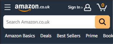
To get an idea of accepted UI design patterns I thought it would be beneficial to put each of the website headers next to each other. This helps confirm what a user expects to see, and where.


What stands out?
Firstly, it is a common pattern to have the masthead logo in the left-hand corner. Placing it here and retaining the ‘click to return home’ functionality would help users become familiar with a site faster.
Second. The ‘hamburger’ icon, although quite ambiguous and not my favourite, appears to be an accepted icon/design for navigating to the menu. On some websites, it appears on the right-hand side of the masthead, and others on the left. Initially, I find it quite confusing when it is placed on the left and find I am scanning for it. Although it is only a matter of seconds, it’s an additional effort placed on the user.
Other common parts of the masthead include a site search and methods of contact.
Most of these mastheads use icons for the tap targets, such as contact and favourites. However, because there is no icon standardisation, the variations could confuse users when they first visit the site. Again, placing an additional load on the user and possibly differing from their mental model.
The best compromise, I think, is using icons with text to guide the user. Reducing potential confusion and adding clarity. Particularly if the icons do not load for any reason.
Now, referring to my own website, the masthead currently looks like this:

My aim when first designing this was to go for simplicity. However, it’s already been stated the importance of the masthead. It (should) appear on all pages so getting the layout correct would be a huge UX win.
In reality, I don’t think the UI design is that bad. A lot of this was based on my previous web developer experience so I already had an idea of what should be included. I didn’t really understand the ‘why’ and knew nothing of mental models.
Taking the above research into account, the layout has been modified to look like this:


The logomark is reduced by running onto two lines but retains its left-hand position. The menu button now has accompanying text, and new calls-to-action for ‘Contact’ and ‘Dash’ have been included.
The layout, whilst retaining a familiar look to the old one, has become more usable. Based on the previous research it has elements that can aid navigation.
It’s not as minimal as I would prefer, but this is the entire point of this article. To design a UI for the user’s mental model, not for my ego.
Will it work? Without real-world A/B testing, it's difficult to confirm. At this time I do not have the traffic numbers to run this sort of test effectively. However, I think it can be agreed that it meets the brief to be designed based on mental models. It’s become a vital component of this website.
Categorised under
Looking for web design or branding serivces in Inverness?
Choose from the options below, if you are looking for expert web development, or finely crafted branding services.

